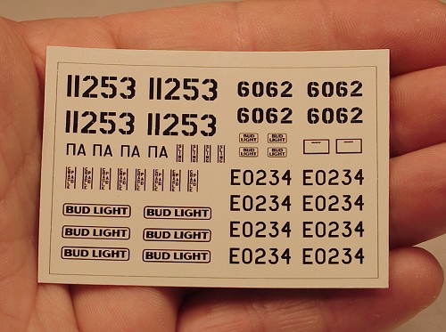
Design your own Alps / OKI custom decals
Most modelers will have heard about Alps decals, either because quite a few small aftermarket decal producers use Alps printers, or because of modelers who own an Alps or OKI printer. You don't need to own an Alps or OKI to create your own decals, because there are a number of custom printers that will do the printing for you. Therefore the Alps technology discussed in this article will be limited to what is required to design Alps/OKI decals.
Designing decals likely requires learning some new software, but it is worth the investment: being able to design your own decals opens a world of new possibilities, and it's great fun. The printing costs are quite acceptable: an A4 or Letter size decal sheet containing only black and white decals cost me around 15-20 dollars. Full color artwork will cost more though, depending on the number of colors used.
|
The Alps printers
Designing your decals
Preparation for printing
Custom Alps decal companies
Custom decal companies using other printers
Links
Reference section:
Vector graphics example
Reprinting decals
Printer models
Cartridges
Hong-Kong based www.alps-printer.com has copied this page completely, without asking or even giving credit.
This conforms to their ethical standards, which includes selling second hand printers with broken print heads.
Buyer beware!
|
A word of warning
This page describes the method that delivers the best possible results, and it's quite an involved process. It is not far removed from the 'professional' way of making decals, and may therefore be intimidating when viewed for the first time. I too would be intimidated if had seen this a couple of years ago. My advise is to start simple, perhaps in one or two colors only, and proceed slowly. I'm sure that the results will encourage you to take the next steps. If you want to quickly print some decals, this page is not the best starting point. There are simpler ways of printing decals with an Alps/OKI, for example directly from a text editor like Word, but they don't give the same quality and flexibility.
The Alps and OKI Micro-Dry printers
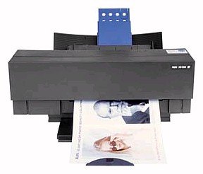
Without going too deep into the technical details, here are the main aspects that make an Alps (OKI) Micro-Dry printer different from other printers:
Alps Micro-Dry inks are some kind of wax, they will not dissolve in water like inkjet ink, and they are light-resistant.
lps has white ink, and this is of major importance for decals. Firstly because many decals have white in them, secondly because you can use white as a base-coat to make opaque color decals. Both arguments will possibly sound of little importance, but try to make color decals with an inkjet and we will talk again.
Most Alps color inks are not opaque, which allows one to print inks over each other and create new colors (see next chapter). Black, metallics and foils are opaque.
The Alps printer allows a lot of tricks, that make decal printing a possibility. For example, it can do spot color printing (using only one ink) instead of only printing tiny spots of cyan, magenta, yellow and black (dither printing) like all other printers do. Also, it is so accurate that you can do multiple printing passes on one sheet without alignment problems.
The resolution is basically 600 dpi. That is more than enough for decals printed in spot color mode: I have Alps-printed decals with readable text of 0.25 mm (1/100th of an inch) height ! With tricks you can make the 5000 model do 2400 dpi, which has some uses for dither printing.
Apart from cyan, magenta, yellow, black and white, there are also silver and gold plain metallics (which have sort of a satin finish) and silver and gold foil metallics (that look like chrome or gold plating).
Citizen, OKI, Kodak, Roland and Powis Parker sold their own versions of the Alps printers, all coming from the Alps production line. You can find a complete list of printer models in the reference section. All except the OKI MicroLine 7050c (Japan-only?) and the Kimosetter 410 are now discontinued (autumn 2012). The Japanese MD-5500 could be ordered until 31 May 2010 through Alps Supplies
Citizen, OKI, Kodak and Roland rebranded the (otherwise 100% identical) CMYK ink ribbons, and introduced new colors, which are mostly compatible across the models, expanding the color palette considerably. A complete list of ink cartridges can be found in the reference section.
Regarding the availability of the cartridges: Alps-USA will stop distributing them from early 2007 on. But Alps-Ireland and OKI-Europe will continue theirs, for at least a number of years. Therefore it is clear that cartridge production still continues at the Alps-Japan factory or its subcontractor. Alps Japan is obliged by law to sell supplies until 5 years after the end of production (31 May 2010).
Elephant's Rocket from Japan offers a repair service (MD-1000, MD-1300, MD-5000 and MD-5500 models) and sells second-hand refurbished printers (with either standard Japanese 100V AC, or a 220-240V AC transformer at extra cost). They also sell all Alps supplies including ink cartridges. They do business outside of Japan, and customer reports are very favorable.
The remainder of this page only gives information on designing decals, not how to use or operate an Alps printer. If you want to know everything about the Alps printer and how to print decals with it, subscribe to the Groups.io 'Alps' mailing list (formerly at YahooGroups). It's still very active, and has very knowledgeable members. Alternatively, you can search the YahooGroups mailing lists archive built by Julian Bradfield which works much easier than the old YahooGroups' search function.
Designing your decals
Vector graphics versus bitmap graphics
There are many ways to design decals. The main choice is whether you want to use vector graphics or bitmap graphics. Every computer user will be familiar with bitmap graphics, since everyone uses Paint, Photoshop, Paint Shop Pro or something comparable to manipulate JPG, GIF, BMP, and dozens more file formats. When it comes to designing decal artwork with bitmap graphics, there are a number of problems. Bitmap software is primarily intended for the manipulation of bitmap images created with digital photography or scanning; making accurate drawings from scratch with bitmap graphics is not easy. Another factor is the resolution. To draw an A4 size decal sheet to be printed at 600 dpi, you need a giant 5000 x 7000 pixel file, and you must draw everything at the right size from the start.
Vector graphics are very different: objects are defined using vectors, not pixels. For example, a rectangle is defined by the (vector) position of its four corners. It also means they have no resolution, so it doesn't matter at all in which size you draw something. This may all sound complicated, but it works very naturally, a bit like a CAD program. However, it requires some adjustments if you're a bitmap person (ask me). It's impossible to explain everything about drawing with vector graphics. A vector graphics example is presented in the reference section.
The popular names in vector graphics are Adobe Illustrator and CorelDraw (free 30 day trial downloads are available of both), Microsoft Expression Design (discontinued), and freeware/shareware software like Canvas and Inkscape. Also, you don't need the latest versions of the software packages mentioned, so it can be worthwhile to pick up an old version cheap. In designing decals you're using only the simple features, and an old version will most likely work just as well. I can say that now I know vector graphics, I never want to go back to bitmap for decals!
If you don't want to convert to vector graphics, the rest of the article will have limited value. Be sure to read David Aungst's article on designing decal artwork with bitmap graphics.
Fonts

CorelDraw comes with 1000 fonts, that you can browse through using Font Navigator. Even with this very useful tool it is often quite a job to find the right font to recreate a 1:1 text. There are a lot of web sites with fonts, here are five:
These sites have powerful tools for determining a font type:
You can also use several fonts made especially for modelers:
Even with all these fonts available, you will not always find what you are looking for. In that case you take the closest font, type the text, and change it to 'curves'. You can now manipulate the characters. Usually this is a lot of work, and it's not easy to keep the characters 'tidy', but it can be done. In fact, it is best to convert all your text to curves if you send it out for printing. Otherwise the printer person must have all your specific fonts installed (chances are very small). You can check whether you still have fonts in your CorelDraw artwork by checking 'Document Information' under the 'File' tab.
Logos
If you need squadron/wing/command badges for aircraft, look here:
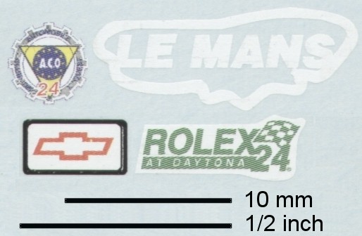
If you need commercial logos, for race cars or trucks for example, have a feast on these sites:
The logo artwork is not guaranteed to be accurate: it is contributed by people like you and me!
Note: you will need a trick to import EPS into CorelDraw. Don't import it straight as an EPS, but choose the 'PS, PRN, EPS - Postscript Interpreted'. Only then you will be able to see and manipulate the artwork.
Reprinting existing decals
Many modelers want to reprint existing decals, usually in a different scale than the original decals. Ignoring the touchy subject of copyrights for a moment, this can be done, but it is a lot of work! Just scanning them and push the 'Print' button results in a very mediocre quality. You will have to redraw everything if you want to achieve good (or even excellent) quality. An example is shown in the reference section.
Color conversion
The site of e-paint.co.uk is very useful to convert all kinds of paint standards to CMYK values. This includes FS595, RAL and BS381C. Whether an Alps can print that CMYK value without very obvious dithering is another question.
Preparation for printing
Spot color printing versus CMYK (dithered) printing
Like 99.9% of all color printers, the Alps printer will normally reproduce colors with dither / halftone / CMYK printing: by printing dots of cyan, magenta, yellow (CMY) and black (K for 'key'), an unlimited palette of colors is created. An exception are pure CMYK/RGB colors, discussed later. Since the Alps printer is 'only' 600 dpi, the dot pattern is visible and can be objectionable for decals, of course depending on the viewing distance. The following example was kindly supplied by Graeme Brown. It shows a decal 12 mm wide.

| 
| 
|
| Artwork
| Dither/halftone/CMYK
| Spot color
|
You can also use the spot color mode. In this mode, the printer uses only one ink cartridge at a time, instead of printing dots of CMY and black to make a color. Taking red as an example, if you print a solid layer of Y, and then a solid layer of M on top of it, the result is a solid red without dithering. A strong drawback is that the color palette is rather limited, as explained in the next section.
Important note: opinions on the use of the two printing methods vary considerably. Train modelers seems to avoid dither printing, since the dithering is too coarse for small trains (however one exception are graffiti decals). On the other hand, car modelers (1/24 or 1/25 scale) seem to find the dithering acceptable. As far as I know, no commercial Alps decals except those by Patto's are printed with dither printing.
Standard mode - Dither printing
The easiest way of printing with an Alps/OKI is the standard printing mode, which gives you dithered printwork. You don't split up the artwork or try to find the right color matches, you simply let the printer do the work for you, and accept the resulting dithering. Black, white and 'pure' CMY colors (see table in the next section) are printed solid, all others as dithered print. The standard settings are 600dpi horizontally and 85lpi vertically, but better resolution are also available (see next section). The visibility of the dither pattern depends on the colors and settings used. The standard printing method is the only method that allows photo-like images, or designs with color gradients to be printed. Examples are nose art on military aircraft and graffiti on trains. Dither printing is also one of the few options to print light (pastel) colors with an Alps/OKI.
The example below, kindly provided by the late Al Superczynski, shows part of the decals for a Le Mans Corvette pace car. It demonstrates the standard printing quality. In this example, black, white and yellow ('pure' CMY colors) are printed solid, the blue, green and red as dither print. The scan is also shown in 1:1 size, but the screen's limited resolution prevents you from seeing the fine dither pattern that would be visible in real life.
Detail scan
|
True size on 17" screen
at 1024x768 pixels
|
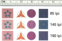
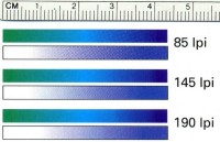
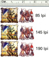
The MD-5000 has selectable halftoning values of 85, 145 and 190 lines per inch (lpi); other MD printers are only capable of 85 and 145 lpi halftones. Higher numbers give smoother looking halftoning colors. This is illustrated by three groups of objects printed at the indicated halftone values, kindly supplied by Peter Wisniewski. The first example below (on the left) shows solid colored objects. The second example (in the middle) shows rectangles with color gradients; green changing over to blue, and white shifting over to blue. It shows how the printer handles all the colors in those ranges. The third example (on the right) shows the result of printing high-resolution bitmap artwork for N scale carnival wagons, a herald of the Royal American Shows and a mural. When viewed with the naked eye, the 85 lpi printed images look terrible, the 145 lpi are a lot better and 190 lpi are quite smooth. In the 190 lpi print the halftoned colors look like they are solid, and the herald and the mural look pretty smooth. All these examples cannot be achieved by spot printing.
To get 190 lpi you need to do the following. Under 'media type' select 'VPhoto print media', that is the only way to 'unlock' the 190 lpi mode. The actual printing surface must be very smooth because the printer will make smaller print dots than usual. Under 'print mode' select 'VPphoto color' and under 'more settings' de-select the 'Glossy finish' and/or 'VPhoto primer'. A problem with 190 lpi printing is that a white undercoat (printed in spot color mode) does not align perfectly with the color inks printed in VPhoto mode. The further you go down a sheet, the larger the misaligment. It can be circumvented by printing the white undercoat as a separate decal.
Standard mode - pure CMYK colors only
If you define all colors in the artwork as 'pure' CMYK colors (see table below), the printer will automatically print them without dithering. An example is CMYK 100,0,100,0 which is 100% cyan, 0% magenta, 100% yellow and 0% black, giving green. Because the decals (usually) need a white undercoat, the artwork is first printed with 'White undercoat' selected in the printer driver. The same page is then printed with the 'Driver Colour Matching' option OFF. The printer then automatically sequentially prints four solid layers of CMYK ink, and not a dithered CMYK pattern. However, the white undercoat is only printed underneath the CMYK inks (avoiding partially translucent colors), and not where the pure white parts were defined in the artwork. Therefore, for decals with white parts, this method is not suited to prepare your artwork for the custom printer.
| ->
| 
|
| ->
| 
|
| Original artwork
|
| Print white with
'White undercoat'
selected
| CMYK printed with
'Driver Colour
Matching' OFF
|
| Actual decals
(scanned)
|
Note: it appears that 'Driver Colour Matching ON / OFF' works differently on the various printers models and/or drivers. Taking pure cyan as an example, CMYK 100,0,0,0 with 'Driver Colour Matching' option off gives a solid layer of cyan on most printers, but with some it still results in a dithered print. However when the color is defined as RGB 0,255,255 (which is exactly identical since CMY and RGB are each others opposites), these printers print a solid layer of cyan.
| Spot Color
| RGB (n/255)
| RGB (n/100%)
| CMYK (n/100%)
|
| Yellow
| 255, 255, 0
| 100, 100, 0
| 0, 0, 100, 0
|
| Magenta
| 255, 0, 255
| 100, 0, 100
| 0, 100, 0, 0
|
| Cyan
| 0, 255, 255
| 0, 100, 100
| 100, 0, 0, 0
|
| Red
| 255, 0, 0
| 100, 0, 0
| 0, 100, 100, 0
|
| Green
| 0, 255, 0
| 0, 100, 0
| 100, 0, 100, 0
|
| Blue
| 0, 0, 255
| 0, 0, 100
| 100, 100, 0, 0
|
| Black
| 0, 0, 0
| 0, 0, 0
| 0, 0, 0, 100
|
| Metallic Gold
| 225, 160, 0
| 88, 63, 0
| 12, 37, 100, 0
|
| Metallic Silver
| 189, 193, 197
| 74, 76, 77
| 26, 24, 23, 0
|
| Metallic Magenta
| 163, 36, 115
| 64, 14, 45
| 36, 86, 55, 0
|
| Metallic Cyan
| 0, 176, 201
| 0, 69, 79
| 100, 31, 21, 0
|
| White
| 230, 230, 230
| 90, 90, 90
| 10, 10, 10, 0
|
| Gold Foil
| 225, 160, 0
| 88, 63, 0
| 12, 37, 100, 0
|
| Silver Foil
| 189, 193, 197
| 74, 76, 77
| 26, 24, 23, 0
|
Standard mode - pure CMYK colors only with split-up artwork
To achieve decals with white parts, there is no way around splitting the artwork in two layers or pages. The first is a page with all the artwork (black parts can be excluded) copied and changed to black, which is then printed with the white ink cartridge. The second page/layer is a CMYK page, just as in the first example. The example shows that the decals are printed correctly, and therefore this method is suited to prepare your artwork for your custom printer, with a rather limited color palette. However, if you know how to split your artwork in layers or pages, why not use the method below and enjoy many more colors?
|
| ->
| 
|
| ->
| 
|
| Original artwork
|
| Artwork page 1:
White (2x)
| Artwork page 2:
CMYK printed with
'Driver Colour
Matching' OFF
|
| Actual decals
(scanned)
|
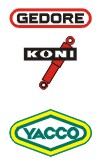
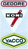
Spot color printing: the complicated method with many more 'solid' colors
If you want more colors without dithering, you can use 'Spot color charts' (see below) to find out all colors available with the spot color overprinting mode. To start simple, the example used above is repeated here, but fully split up in layers/pages. The complete decal design is copied to pages representing W, C, M, Y and K, and then the parts that are not to be printed in that spot color are deleted. The remaining parts are then changed to black, so each spot color will be printed full strength (this is a difference with 'normal' color separation in the printing business, where greyscale values are used). This manual color separation may look complicated, and indeed it requires some getting used too, but after that it's pretty easy. This format is preferred by most custom printers.
|
| ->
|
| 
| 
| 
| 
| ->
|
|
| Original artwork
|
| Artwork page 1:
White (2x)
| Artwork page 2:
Cyan
| Artwork page 3:
Magenta
| Artwork page 4:
Yellow
| Artwork page 5:
Black
|
| Actual decals
(scanned)
|
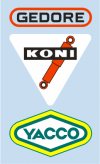
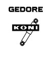
Note: with some printers there is a problem with printing black over other colors. In the above example, that would mean leaving out the black parts in the white triangle of the 'Koni' decal.
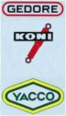
In the second example a double pass with the Cyan ink is performed to make it more opaque, resulting in two hues of blue. There is no layer/page for the Black ink, since there is no black artwork.

| ->
| 
| 
| 
| 
| 
| ->
| 
|
| Original artwork
|
| Artwork page 1:
White (2x)
| Artwork page 2:
Cyan
| Artwork page 3:
Cyan
| Artwork page 4:
Magenta
| Artwork page 5:
Yellow
|
| Actual decals
(scanned)
|
Alternatively, you don't delete the unwanted parts, but change them to white. This can be an important technique if you have complicated artwork, for example designs with extrusions or shadows.
Color matching method 1
|
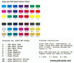
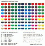
An important note is that the on-screen colors may deviate considerably from the real print colors. I've heard conflicting opinions on the color presentation of the color charts shown below. Some report the real print shows more colors than the scanned color charts shown below, and that the various red/orange shades appear as virtually the same red in the scans, and the darker shades of blues, greens and purples appear black. Yet others report that they can't produce the color variety shown in the scans, possibly because the scanning makes it look like there are more colors than the eye can naturally see. Shades of black all look pretty black in reality, all the reds look much the same, as do the greens. Lighter shades appear much darker than in reality. Without having a color chart, this remains a difficult problem. You could consider ordering a spot color chart from one of the custom printers listed at the end of the page.
|
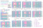
The Alps and OKI printers are basically designed to use CMY plus black and white inks. In the spot color mode, this gives you a fairly limited color palette, as shown below on the 'Alps and OKI Spot Color Chart' created by William Brillinger of Precision Design Co. and used with permission. The printing order is of limited importance, for example Y+M is tomato red, M+Y is a little darker red. Sometimes you will need a double layer of color. For example, a single pass of cyan will give a light blue color, and a double pass a middle blue color.
However, the red, green and blue (RGB) ink cartridges of the OKI-7000 printer can also be used in other Alps and OKI printers. It requires a trick with label swapping, but that's for the printer person to worry about. The combination of CMY and RGB gives a much larger color palette.
Here's another CMY + RGB palette, created by John Isherwood of Cambridge Custom Transfers and used with permission. An important difference with the previous two charts is that this chart was corrected so the on-screen colors match those of the actual printed colors. Still the color representation depends on your computer screen, and some report that they cannot match the color variety of this chart.
The palette can be expanded further by using 'OKI Opaque White' ink, which isn't opaque! By printing OKI Opaque White over colors, you can achieve pastels and greys. Technical note: on about half of the Alps and OKIs the white overcoat will not adhere. This can be solved by slightly increasing the print temperature, either by using a hair dryer or using a 'hotter' cartridge label. An alternative solution is printing your decal in the full-strength color and a copy in white, and layer the decals on the model.
Some rather complex receipies can be found in the color charts. An example is 'warm yellow'. Alps Yellow is a very bright yellow. By printing two layers of Alps White, one layer of Red (or alternatively Kodak Orange) and two layers of OKI Opaque White a slightly reddish base is achieved, and with one layer of Alps Yellow over this base a warm yellow is finally achieved .. An obvious drawback of complex color matching is that (in extreme cases) ten to twenty printing passes will be required for a sheet with multiple color decals. Of course this will increase the cost and the risk of errors.
Another problem of spot color matching is that it is often difficult to find an exact match of a specific color (for example RAF Sky for squadron codes, or a specific Federal Standard 595 grey color). On the other hand, many model manufacturers and even aftermarket decal producers don't always have accurate colors, so perhaps a reasonable match will do anyway.
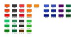
Color matching method 2
John Peck of Precision Labels & Decals was not satisfied with the color representation of the above color charts, and created his own, in a very methodic way that was first tried by Eric Tetangco. They are shown here with permission.
John started by printing single and double layers colors, using a table format that shows every possible combination. Alps/OKI Cyan, Magenta and Yellow, OKI Red, Green and Blue and Kodak Process Orange and Process Green were used in the color table. John even printed a separate color table that uses the metallic inks as the first layer, creating several new colors. The adherence of certain layers can be pretty bad, notably when over printing Magenta or Red, or with any attempt to overlay with Process Orange. The use of Finish between passes made no difference. The problem differs between printers, possibly because the individual print head settings. The two layers table contains interesting information on the adhesion of the inks, since it is a diagonally mirrored arrangement. For example R1-C2 shows adhesion problems, whereas C1-R2 has no problems.
Also of importance is that the color chart was scanned, not photographed. This had an effect on the representation of metallics and particularly foils: due to their reflective natures, they almost never scan as seen. The particular scanner lights may cause fluorescence in any type of ink or underlying media which can distort colors in various unpredictable ways. One example is Process Orange over Process Green or vice-versa in the two layer chart; in reality it is an olive green, the scan shows an apple-like green.
Next was a set of tables showing the results of three layers. Each table is read as follows: start with the top row, then follow clockwise for the successive layers. The top and right rows are always identical, the bottom row keeps moving left one step with each of the eight tables. This results in a methodic analysis of all color combinations possible with three layers.
John even went so far as to create a four-layer table, using the same system. In this chart 'only' CMY and RGB are used, hence 6 times 6 makes 36 tables!
John overprinted the one, two and three layer color charts with one layer of OKI Opaque White.
Lastly, John photographed the complete color chart with his digital camera in natural light.
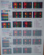
The full color chart can be ordered from Precision Labels & Decals. It's not cheap, but one must realise that printing a color chart is both time-consuming and quite costly regarding the inks. I believe it is a very good investment for anyone designing Alps decals.
White ink
White ink is one of the unique features of the Alps/OKI printers, and essential for decals, but there are also some problems with this ink:
- Opacity: many, but not all, judge the ink to be not opaque. This is not necessarily a problem on light and/or single colored surfaces, but if you apply a single-layer white decal on a darker multi-color surface, you will likely see different hues of white. For light background colours (such as silver, yellow, etc), one or two layers is sufficient. For dark background colours, two or three layers are advisable. For military models, you could opt to use one layer anyway, to avoid high-contrast bright white markings. A single or double layer of white is also used under color decals, again to prevent the model's color from shining through.
- Double printing: printing white on white can be a problem, with the second layer not adhering properly and flaking off during printing. The printer manual states that the printer is not able to print multiple white layers, but it seems to vary from printer to printer, possibly caused by the temperature settings of the printing head. Also, a warmed-up printer seems to work better for white. I've seen a decal sheet with flaking white at the top, and good double coverage in the middle.
A trick that reportedly helps adhesion is the use of a burnishing ribbon (Finish I or II) after the first layer of white. It is also reported that VPhoto Primer works very well in making a White stick on other colors and metallics. Relabelling a white cart with a VPhoto Primer label and using it for the second white layer (telling the printer this second layer is VPhoto Primer, not white) is another technique reported.
Yet another technique is printing OKI Opaque White over standard White, avoiding the adhesion problem of standard White on standard White. However, with most printers you cannot print other inks over Opaque White, only Opaque White sticks to Opaque White. Unless tricks are used (such as VPhoto Primer on the Opaque White) this combination cannot serve as a white base coat for color decals.
- Beware of the 'White Undercoat' feature, which on some models will print at 150 dpi only and leaves ragged edges peeping from under the decal. The OKI 5000 is confirmed to print at the normal 600 dpi with the 'White Undercoat' setting.
Custom Alps decal companies
Here is a list of around 40 companies and individuals that offer custom Alps decal printing service, grouped by country:
Australia
Canada
CanMilAir Decals. Does custom work apart from the Canadian decal range. Stopped in 2018, among other because the printers and cartridges were running out
Jbot decals, Jim Botaitis. Active again after a pauze. The shopping cart is deactivated, but you can contact Jim directly via e-mail if you have a special request
R-Dec Water Slide Decals (e-mail), W. Robert Franklin
Finland
Arctic Decals is a small waterslide decal producer, with the focus on obscure civil aircraft, using laser, UV-ink and Alps printers
France
Upnorth (e-mail). Produces Alps decals on demand, apart from their regular screen printed decals
FFSMC Productions. FFSMC has its own Alps and laser printed decal lines in several scales, but also does custom work
Germany
HaHen, Harald Hensel. Has a line of 'regular' Alps/OKI decals for post-war Luftwaffe models, but also does custom printing
Peddinghaus Decals. Has a large line of 'regular' Alps for many subjects and scales, and also does custom printing
Tailormadedecals. Has a catalog of decals for large RC planes, but also does custom printing
Italy
Luca Beato. Has a line of Alps decals for Italian aircraft, and also does custom printing for all subjects
Max-Model. Has a line of decals for Italian emergency vehicles, for trucks and for slotcars. They also do custom printing for all subjects
New Zealand
South Africa
Spain
ASB Models, does custom work beside regular lines of Alps decals for police cars, license plates, replacement decals for Matchbox and Dinky, and others
Decal Lab, a graphic designer who enjoys making and printing decals for cars and bikes
Mask Decals. Miguel Sastre has designed and printed dozens of custom car and motor Alps decals in various scales, that can be viewed in his blog
United Kingdom
USA
Andy's Alps Decals. Specializing in custom decals for scale models
Barney Kable (e-mail). Specialty: printing FS color matches
Bedlam Creations. Artwork can be supplied as graphics, photos, or an idea
Cedarleaf Custom Decals. Apart from its standard railroad decal range, Cedarleaf does custom work for railroads and other applications
Dan's Resin Casting. See 'custom decals' tab
Decal Connection. Makes decals for many applications. Will not print decals with copyrights unless permission is given in writing
Decal Man. Probably only car decals
Diecast and Decals. Specialises in graphics for diecast vehicles
E.L.S. Trains. Prints Alps decals for model railroading and all types of scale models
Great Decals. Has links to numerous custom railroad decal printers
John Hagen (e-mail), Alps decals any scale down to and including N scale. Can do artwork from photos or sketches
ModelWerks. Produces decals for Bandai Gundam models, and also does custom decal work
Polecat Decals. Has a catalog of more than 200 sets for short track race cars, and does custom work too.
Speedway Decals. Tommy Logan has a line of decals for dirt track racers, and offers custom decals including artwork design
Tango Papa Decals, Tom Prestia. Tango Papa also sells the decal paper that is most popular with US modelers
Exact Decals & Details. Apart from a catalog of Alps printed aircraft decals, Exact also offers custom design and printing service. Website was last active in 2014.
Fireball Modelworks, Joseph Osborn. Produces a line of Alps decals for helicopter models and does custom work. Printing service was halted in March 2017 due to printer failure.
Firebird Designs. Has a catalog of more than 300 sets for US car models, and probably does custom work too.
Greg's Decal Graphics. Besides a line of Alps printed hot rod and custom car decals, Greg also offers custom decal work. Probably no longer active, the website lists tourist attractions. The original website was active until 2016. An archive of his decal sheets can be seen on Fotki
GWS Custom Decals. Designs and prints custom decals for car models. Website was last active in 2014.
Kadee Quality Products. A train manufacturer that also does custom decal work. The relevant webpage was last active in 2012.
Red Pegasus Decals. Produces a line of Alps printed air racing decals, but also does custom work. The owner passed away in June 2017, status is unsure
Scale Rail Graphics. Produces decals for primarily model railroading, and also does custom decal work, but no race car, military or rocket decals. The website reports that Scale Rail Graphics is closed.
Shawn Hull Decals. Custom decals are no longer mentioned on the website, so this service is probably discontinued. Website was last active in 2015.
Some items to discuss with your custom printer are: type of software and version used (CorelDraw, Illustrator, or perhaps PDF files), which ink-sets are used (always CMYK, but possibly RGB too, and just maybe Kodak orange and green), whether the printer can print two white layers on top of each other (not all printers can do this, yet you need two layers to make opaque white), whether black can be printed over other colors or not, and which decal paper is used (thickness etc), margins to be used in the artwork (at least 15 mm top and bottom, 5 mm left and right), whether the artwork should be put in separate pages, separate layers or even separate files. Most companies will also offer a decal design service. This is usually quite expensive, which is quite understandable if you look at the amount of work involved (see above!).
Custom decal companies using other printers
Since the Alps printers are getting old and rare, I started a new list in 2018 showing companies that offer custom decal printing on other printers that can print white too. This list is just the start and likely very incomplete.
Australia
Canada
Germany
DecalDoc. Has a large line of race cars decals in various scales, and also does custom printing on a Roland Versa Cam Printer
DecalPrint.de. Mostly truck decals, huge catalog. Also has a custom decal printing service (CorelDraw files)
Druckeronkel. Rather technical site, but lots of techniques, including neon colors
Scalegrafixx. Mostly race car decals. Contact via e-mail
Italy
Netherlands
Black Lion Decals. Uses OKI laser and Alps Micro-Dry printers. Black Lion has its own decal lines in 1/72, 1/35 and 1/16, but also does custom work, if time allows
Decals.nl. Has a large line of truck decals in various scales, and also does custom printing for all subjects in all scales. Can also print 500 metallic colors
Decalwinkel. Uses a laser printer that has the black cartridge swapped for a white one. Prints from JPG and PDF files. Closed shop in September 2022.
Decal-sheets.nl. Has a line of decals in various scales, and also does custom printing
PrintMetWit. Produces custom decals and stickers, plus 3D prints. Accepts vector and bitmap files.
Poland
Spain
United Kingdom
USA
Circus City Decals. Produces railroad decals, and does custom work too
Decalcomaniacs (Facebook) or the old site (no longer maintained) or
the Ebay Store. Has a large line of armour decals in various scales. Also does custom work. Laser printed with separate white undercoat (two stage decals)
Draw Decals (or this site). Has a large line of airliner decals in various scales using 'Digital Silk' decal technology. Does custom work on a 'time available' basis, and artwork has to be provided in vector format.
Circle Track Decals. Has a line of more than 150 Indy car of 70 sprint car decal sets in various scales, and also does custom printing for most subjects in all scales. Circle Track Decals can create the artwork from photos. Technology used appears to be a combination of Alps and color laser.
Fusion Scale Decals. Has lines of aircraft, cars, generic, railroad, trucks and police cars decals, and does custom decals
Highball Graphics. Has a large line of railroad decals in various scales, and also does custom printing. Uses an OKI C942, a 1200 dpi that uses cyan, magenta, yellow, black and white. Artwork must be supplied in vector graphics.
Indycals Decals. Has a large line of Indy car race decals in various scales, and also does custom printing for most subjects in all scales. Artwork must be supplied in Illustrator format.
OBS-CALS Your Source for OBScure deCALS (e-mail only) operated by John Hagen, does custom decals
Print It Decals. I think this company also offers a custom decal service.
STS Scale Model Car Water Slide Decals. Mainly car models, but does custom decals too.
Links
A few links on the subject:
My very first Alps decals, a small and simple set in black, printed by Luca Beato.
Reference section
Drawing with vector graphics
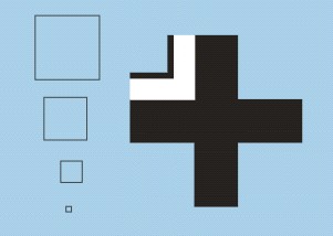
It's impossible to explain everything about drawing with vector graphics. I've made one example showing a a basic design that would be a good learning exercise: a pre-war Luftwaffe iron cross. There are dozens of ways of designing things like this, and this is the method that I came up with. For the rest, follow the tutorials, use a book, or just dive in. As reported above, you don't need to know all the features, so keep it simple. Having a decal design you want to create helps a lot for motivation!
| 
| 
|
| 1: The original German drawing had parts defined in fractions of 1/4, 1/8 and 1/32 of the overall dimension. Therefore I defined a 32x32 mm square as the basis of the iron cross, and 12x12, 8x8, 4x4 and 1x1 mm squares as drawing aids.
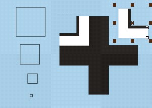
| 2: Set 'snap to objects' on, and move the 12x12 square to a corner of the large square. It will 'snap' in place. Then draw guidelines by 'pulling' them from the rulers, using the 'snap' feature to draw them exactly over the 12x12 square.
| 3: Move the 12x12 square to two other corners to draw two more guidelines. Also draw guidelines over the 32x32 mm square.
|
|
| 
| 
|
| 4: Take the 8x8 mm square to draw to more guidelines in the upper left corner left, again using the 'snap' feature.
| 5: Set 'snap to guidelines' on. Repeat the above with the 1x1 mm square.
| 6: Delete the 32x32 mm square. Plenty of guidelines now!
|
|
| 
| 
|
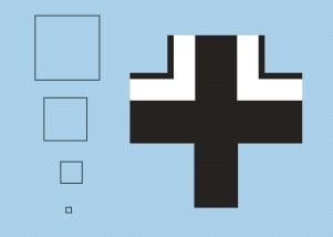
| 7: Draw the center black part of the iron cross, again using the 'snap' feature to make sure you're drawing an accurate cross.
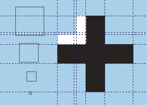
| 8: After you reached the starting point, the object is 'closed' and can be assigned a fill color, black in this case. Set the outline to 'no outline', otherwise a hardly-visible black outline would remain and mess up the end result.
| 9: Using the same method, draw the white piece. Here you won't easily forget to delete the outline, because it is well visible.
|
|

| 
| 
|
| 10: Again with the same method, draw the thin black part.
| 11: You can now delete all the guidelines.
| 12: Copy and paste the two smaller parts, mirror them, and move them to the right.
|
|
| 
| 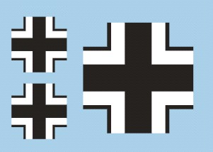
|
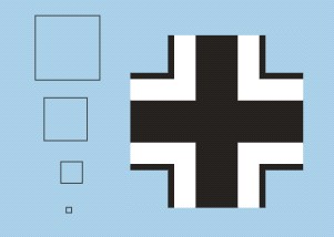
| 13: Move the parts to the upper right corner. They will click in place because 'snap to objects' is still switched on.
| 14: Repeat the copy, paste, mirror and move action twice to finish the cross
| 15: The basic design is now finished. You can copy and paste it, and reduce or enlarge it to the desired size for the model.
|
Reprinting existing decals
There is no simple way to scan and reprint existing decals, and achieve a good quality. A scanned decal sheet gives you a bitmap picture, not vector graphics. To convert a bitmap picture to vector graphics, you could use tracing programs like CorelTrace, but they don't give you simple and closed shapes that can be used for subsequent printing. In my experience, you will have to redraw everything manually - quite a lot of work, but the results can be better than the original.
Here's an example of how I do it. The first picture shows the scan of the car decal I wanted to reproduce. If you look closely you can see the ragged edges of the rather low-quality silkscreen printing. I imported the bitmap scan in CorelDraw, putting it in its own layer.
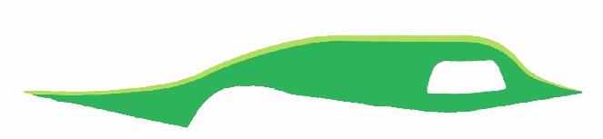
In another layer I drew a rough copy of the outline (shown deliberately outside the decal contour here). Then came the time-consuming part: moving the control points, deleting and adding points, and manipulating the Bezier handles of each control point. In my experience fewer control points give better results.
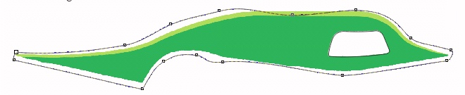
When that job was finally done, I drew another line over the color division of the decal. Lastly I drew the opening in the decal.
Next step was to copy the three lines, and paste them elsewhere on the sheet. I now had the basic design in vector graphics, as outlines.
The color division line was used to cut the overall shape in two pieces, and the opening was trimmed from the lower part. Finally, I gave the two pieces a color that matched the original decal, and selected 'no outline' to get rid of the black outline. Whether the two greens can be found in one of the palettes is another problem! One decal done..
A close-up shows the quality of the bitmap scan (left) compared to the vector design (right). Note that the design needs further fine-tuning, since the yellow-green stripe doesn't have a continuous taper.
If the scanned decal consists of text, you first try to find a font that is largely identical (CorelDraw has Font Navigator for this). Type the text, change it to 'curves', and manipulate the text as necessary.
A good example of decal redrawing is the Airfix F-4 decal sheet that Rob van Riel did. It is definitely a lot better than the original!
Printer versions
There's a confusing number of printer versions. This table lists the printers in chronological order, with their specifics. The Alps/Citizen/OKI list is largely based on information collected by Julian Bradfield. Kodak's First Check printer is roughly comparable with the OKI DP-7000, but it uses a different set of inks, and must have completely different drivers. Roland makes combined printer/cutters based on Alps technology, which use compatible wax ribbons and non-compatible resin ribbons. Additionally, Powis Parker sold a rebadged MD-5000 as the FoilFast printer, claiming it has its own unique print head, firmware and software. Kimoto sells a Kodak First Check equivalent (around 3000$). All except the OKI MicroLine 7050c (Japan-only?) and the Kimosetter 410 are now discontinued (autumn 2012).
| Alps
| Citizen
| OKI
| Kodak
| Roland
| Powis Parker
| Focus Digital Technoloy
| Kimoto
| Specifics
|
| MD-2000S
| Printiva 600C ?
| -
| -
| -
| -
| -
| -
| Introduced 1995. Japan only. Supports standard colors and metallics.
|
| MD-2010
| Printiva 700
| -
| -
| -
| -
| -
| -
| The basic model. Like MD-2000S. It doesn't recognise White cartridges.
|
| MD-2300
| -
| -
| -
| -
| -
| -
| -
| Accepts Photo cartridges for Dye Sub printing. Doesn't recognise White cartridges.
|
| MD-4000
| Printiva 1700
| -
| -
| -
| -
| -
| -
| Like 2010 but with a scanner head.
|
| MD-1000
| Printiva 600C ?
| -
| -
| -
| -
| -
| -
| Introduced ~1997. 1200 x 600 dpi resolution in color printing. Supports White cartridges. Holds four cartridges. Printiva is white plastic.
|
| MD-1500
| -
| -
| -
| -
| -
| -
| -
| Like 1000 but with a scanner head.
|
| MD-1300
| -
| -
| -
| -
| -
| -
| -
| Like 1000 but accepts Photo cartridges for Dye Sub printing
|
MD-5000
MD-5000i
| -
| DP-5000
| -
| -
| FoilFast
P21
| -
| -
| Holds eight cartridges. Recognises White cartridges. Can print at 2400 x 600 dpi instead of 600 x 600 dpi by having variable size 600 dpi dots, in the VPhoto mode. This has no use when printing in the spot color mode, the main mode to print decals. It can be useful when printing bitmap artwork. Can print with Dye Sub(limation) if fitted with a special key, but Dye Sub is not suited for normal decals. MD-5000i is a Japan-only version with see-through case tops in either blueberry, grape, tangerine, lime, and strawberry. FoilFast is not a direct equivalent.
|
| -
| -
| DP-5000s
| -
| -
| -
| -
| -
| Can print up to 1.35 meter long prints (e.g. banners). VPhoto is limited to 145 lpi (no option for VPhoto media) instead of 190 lpi as with DP-5000. Cannot do Dye Sub.
|
| MD-5500
| -
| -
| -
| -
| FoilFast
P21X
| -
| -
| Introduced late 1999, Japan only. Sales ended 31 May 2010. USB instead of parallel connection. Supports long paper printing, 224 by 594 mm max. Recognises White and Opaque White cartridges, the latter only in back-print mode. FoilFast is not a direct equivalent.
|
| -
| -
| -
| -
| -
| -
| MP-6000
| -
| Chinese production, possibly equivalent to MD-1300, see the printer specifications (MD-4800 was reported by the salesman, but that model never existed) |
| -
| -
| DP-7000
| First Check
| -
| -
| -
| Kimosetter 410
| Pre-press printer for professional use, expensive. Has room for nine cartridges. There are several more ink cartridges for OKI model (notably Spot Red, Blue and Green). The Kodak printer uses a rather different set of inks, and must have completely different drivers. The Kimosetter 410 does in essence behave like the Kodak, in as much as it requires the First Check driver and recognises cartridges with the Kodak bar codes
|
| -
| -
| DP-7050c (Microline 7050c)
|
| -
| -
| -
| -
| Probably an updated version of the DP-7000. Appears to be available in Japan only.
|
| -
| -
| -
| -
| PC-12
| -
| -
| -
| Described as an Alps printer on steroids. Its mechanisms are almost identical, and the cartridges are identical in terms of size and shape. Holds nine cartridges. Also does cutting, probably leading to the name 'printer-cutter 12'.
|
| -
| -
| -
| -
| PC-60
| -
| -
| -
| Follow-up model?
|
| -
| -
| -
| -
| PC-600
| -
| -
| -
| Follow-up model?
|
Ink cartridges
The basic inks for the Alps/OKI printers are Cyan, Magenta, Yellow and Black, but there is much, much more. The range of ink cartridges of five (or six if you include Powis Parker) different brands is confusing, and therefore I put together this table. The cartridges of all five brands are identical in function, and just re-branded. The Alps, Citizen and most OKI cartridges carry exactly the same labels, and work with no modification. The Kodak, Roland and Powis-Parker cartridges likely require re-labeling. The non-Dye Sub cartridges are sometimes called 'Standard'. Roland produces two types of cartridges: wax-based and resin-based. Only the wax-based inks are compatible (or likely identical) to Alps/OKI inks, and hence only these are listed. The Powis Parker cartridges work in at least the Alps MD-5000 after relabeling.
The DP-7000 colors Spot Red, Green and Blue are slightly different from red, green and blue mixes with Cyan, Magenta and Yellow. OKI Spot Red is paler than the red from Magenta plus Yellow, and with more yellow, giving an orange red. OKI Spot Green is a yellowish green, versus the blueish green of Y on C. OKI Spot Blue is a proper blue - no hint of purple as you get with Cyan plus Magenta - and again paler. Additionally, because red, green and blue are achieved with just one layer of ink and hence reduced opacity, new color mixes are possible.
The Kodak First Check cartridge range contains two unique cartridges: Process Green and Process Orange. Kodak Process Green is the same shade as green produced by Cyan and Yellow, except paler and around 50% of that opacity. The reduced opacity opens possibilities for new color mixes, such as shades around olive green when mixed with Process Orange. Process orange is a welcome color, since orange is impossible to mix from CMYK in spot color mode.
The silver and gold metallics have a satin finish, the silver and gold foil metallics look like chrome or gold plating. Another desciption is that silver foil looks like a polished piece of metal, while metallic silver looks like dull silver paint. The Metallics and Foil cartridges appear to have limited use for modeling purposes at first sight, but there are some. I've seen fastener / rivet decals printed with them.
Model car emblems are another good application, especially when they are printed with four layers of ink. This gives it thickness, a 3-dimensional effect, so it looks like a real scale emblem, not a decal. They can also be used to create layered spot colors. Compared to Standard Cyan and Standard Magenta, Metallic Cyan and Metallic Magenta overprinted with Standard cartridges will result in slightly different colors, partly because they are opaque and because their colors are different. Foil inks, despite their glass-smooth appearance, can still be overprinted very well with Standard colors, resulting in shiny and foil-like colors.
The use of so many different inks can create problems with adhesion. It strongly appears that the individual printer settings play an important role here, so it is not very useful to report adhesion problems of specific colors. It also appears that with the ink thickness building up, the risk of scratching increases.
Modern Printing from Germany offers a cartridge refilling service, for Cyan, Magenta, Yellow and Black, plus Metallic Gold and Silver.
| Alps
| Alps Japan
| Citizen
| OKI
| OKI Japan
| Kodak
| Roland
| Powis-Parker
| Alps/Citizen/OKI bar code
| Remarks
|
Standard Cyan
(106020)
| Cyan
(MDC-FLCC)
| Cyan
(KE37902-0S and 3000056)
| Cyan
(41067601)
| -
| Cyan
(0563700)
| Cyan
(CR-MW-CY)
| -
| 03
|
Standard Magenta
(106015)
| Magenta
(MDC-FLCM)
| Magenta
(KE37903-0S and 3000057)
| Magenta
(41067602)
| -
| Magenta
(0563692)
| Magenta
(CR-MW-MG)
| -
| 02
|
Standard Yellow
(106010)
| Yellow
(MDC-FLCY)
| Yellow
(KE37904-0 and 3000058)
| Yellow
(41067603)
| -
| Yellow
(0563684)
| Yellow
(CR-MW-YE)
| -
| 01
|
Standard Black
(106005)
| Black
(MDC-FLCK)
| Black
(KE37901-0S and 3000055)
| Black
(41067604)
| -
| Black
(0563676)
| Black
(CR-MW-BK)
| -
| 00
|
Econo Black
(105146)
| Econo Black
(MDC-ECBK)
| -
| Econo Black
(41067605)
| -
| -
| -
| -
| 23
| for Alps MD-5000 and OKI's, can be reversed up to 20 times for draft printing. Not useful for decals.
|
White
(106050)
| White
(MDC-SCWH)
| -
| White
(41067610)
| -
| -
| -
| -
| 16
| not opaque, therefore print two (some say three) layers. Cartridge content is only 50% compared to Cyan, Magenta and Yellow cartridges.
|
Standard CYMK aka Multicolor
(106025)
| Multicolor
(MDC-FLML)
| Multicolor
(3000092)
| Multicolor
(41644611)
| -
| -
| -
| -
| 04
| The Multicolor cartridge doesn't work in the OKI's, yet such a cartridge exists.
|
|
|
|
Metallic Silver
(106045)
| Metallic Silver
(MDC-METS)
| Metallic Silver
(3000062)
| Metallic Silver
(41067616)
| Metallic Silver
(MLC-SMTS)
| Metallic Silver
(0563593)
| -
| -
| 11
| Alps Metallic Silver and Kodak Metallic Silver are not the same in appearance (less bright) and formulation. See also Metallic Gold.
|
Metallic Gold
(106030)
| Metallic Gold
(MDC-METG)
| Metallic Gold
(3000059)
| Metallic Gold
(41067615)
| Metallic Gold
(MLC-SMTG)
| Metallic Gold
(0563601)
| -
| -
| 08
| Alps Metallic Gold is described as shiny and brighter, whereas the Kodak Metallic Gold is described as a duller bronze color. Also, the latter is a full length cartridge, the former has a short ribbon
|
Metallic Cyan
(106040)
| Metallic Cyan
(MDC-METB)
| Metallic Cyan
(3000062)
| Metallic Cyan
(41067618)
| -
| -
| -
| -
| 10
|
Metallic Magenta
(106035)
| Metallic Magenta
(MDC-METR).
| Metallic Magenta
(3000061)
| Metallic Magenta
(41067617)
| -
| -
| -
| -
| 09
|
Silver Foil
(105150)
| Silver Foil
(MDC-FMES)
| -
| Silver Foil
(41067609)
| Silver Foil
(MLC-SFLS)
| Silver Foil
(0563619)
| Silver Foil
(CR-MW-FSL)
| Silver Foil
(C207)
| 06
|
Gold Foil
(105148)
| Gold Foil
(MDC-FMEG)
| -
| Gold Foil
(41067608)
| Gold Foil
(MLC-SFLG)
| Gold Foil
(0563551)
| Gold Foil
(CR-MW-FGL)
| Gold Foil
(C252)
| 05
|
| -
| -
| -
| -
| Red Metallic Foil
(MLC-SMTR)
| -
| -
| Red Metallic Foil
(C233)
|
| For MicroLine 7050c and Powis-Parker printer
|
| -
| -
| -
| -
| -
| -
| -
| Green Metallic Foil
(C223)
|
| For Powis-Parker printer
|
| -
| -
| -
| -
| Blue Metallic Foil
(MLC-SMTB)
| -
| -
| Blue Metallic Foil
(C212)
|
| For MicroLine 7050c and Powis-Parker printer
|
| -
| -
| -
| -
| -
| -
| -
| Premium Black
(C201)
| 15 & 63
| For Powis-Parker printer
|
| -
| -
| -
| -
| -
| -
| -
| Premium White
(C208)
| 14 & 63
| For Powis-Parker printer
|
|
|
|
Cyan Photo Quality
(105812)
| Photo Color Cyan
(MDC-DSCC)
| -
| Dye Sub Cyan
(41067612)
| -
| -
| -
| -
| 27
| Dye Sub cartridge, generally unsuited for decals. Dye Sub cartridges are blue instead of dark gray.
|
Magenta Photo Quality
(105814)
| Photo Color Magenta
(MDC-DSCM)
| -
| Dye Sub Magenta
(41067613)
| -
| -
| -
| -
| 26
| Dye Sub cartridge, generally unsuited for decals. Dye Sub cartridges are blue instead of dark gray.
|
Yellow Photo Quality
(105816)
| Photo Color Yellow
(MDC-DSCY)
| -
| Dye Sub Yellow
(41067614)
| -
| -
| -
| -
| 25
| Dye Sub cartridge, generally unsuited for decals. Dye Sub cartridges are blue instead of dark gray.
|
|
|
|
| -
| Opaque White
(MDC-OPWH)
| -
| Opaque White
(41644601)
| Opaque White
(MLC-EOPW)
| Opaque White
(0563643)
| -
| -
| 7
| for MD-5500, OKI DP-7000 and Kodak First Check, for use as an overcoat on back-print film. Even less opaque than Alps Standard White and OKI White, but this allows the creation of pastel colors
|
| -
| Spot Red ?
(MDC-LBFR)
| -
| Spot Red
(41644602)
| Spot Red
(MLC-SDTR)
| -
| -
| -
| 32 & 62
| for OKI DP-7000, reportedly work well in other printer models
|
| -
| -
| -
| Spot Green
(41644603)
| Spot Green
(MLC-SDTG)
| -
| -
| -
| 33 & 62
| for OKI DP-7000, reportedly work well in other printer models
|
| -
| Spot Blue ?
(MDC-LBFB)
| -
| Spot Blue
(41644604)
| Spot Blue
(MLC-SDTB)
| -
| -
| -
| 34 & 62
| for OKI DP-7000, reportedly work well in other printer models
|
| -
| Spot Black ?
(MDC-LBFK)
| -
| Spot Black
(41644605)
| Spot Black
(MLC-SBLK)
| Spot Black
(0563635)
| -
| -
| 0 & 62
| for OKI DP-7000 and Kodak First Check, reportedly work well in other printer models
|
|
|
|
| -
| -
| -
| Process Black
(41644606)
| Process Black
(MLC-PHDK)
| Process Black
(0563676)
| -
| -
| 35 & 62
| for OKI DP-7000 and Kodak First Check, for press colour simulations. Reportedly problematic to print in other printer models
|
| -
| -
| -
| Process Cyan
(41644607)
| Process Cyan
(MLC-PHDC)
| Process Cyan
(0563700)
| -
| -
| 38 & 62
| for OKI DP-7000 and Kodak First Check, for press colour simulations. Reportedly problematic to print in other printer models
|
| -
| -
| -
| Process Magenta
(41644608)
| Process Magenta
(MLC-PHDM)
| Process Magenta
(0563692)
| -
| -
| 37 & 62
| for OKI DP-7000 and Kodak First Check, for press colour simulations. Reportedly problematic to print in other printer models
|
| -
| -
| -
| Process Yellow
(41644609)
| Process Yellow
(MLC-PHDY)
| Process Yellow
(0563684)
| -
| -
| 36 & 62
| for OKI DP-7000 and Kodak First Check, for press colour simulations. Reportedly problematic to print in other printer models
|
| -
| -
| -
| -
| -
| Process Green
(0563650)
| -
| -
| 33 & 61
| for Kodak First Check, for pre-press simulations of hexachrome printing. Different from OKI Spot Green, described as a pale Cyan plus Yellow
|
| -
| -
| -
| -
| -
| Process Orange
(0563668)
| -
| -
| 32 & 61
| for Kodak First Check, for pre-press simulations of hexachrome printing
|
|
|
|
Finish I
(106054)
| Finish I
(MDC-FLCG)
| -
| -
| -
| -
| -
| -
| 17
| Burnishing ribbon, a non-stick plastic-only ribbon, used to allow the print head to re-heat, melt and iron down the previously printed ink. It glosses up the printed areas, and normally makes the decals more professional looking and improves scratch resistance.
|
Finish II
(105144)
| Finish II
(MDC-FRVG)
| -
| Finish II
| Finish II (MLC-)
| -
| -
| -
| 19
| Burnishing ribbon, reversible up to five times, but contains much less ribbon. Reportedly Finish I is better for decals. For 5000-series and later.
|
VPhoto Primer
(105142)
| VPhoto Primer
(MDC-PREP)
| -
| VPhoto Primer
| VPhoto Primer (MLC-)
| -
| -
| -
| 18
| Undercoat for VPhoto 2400 dpi printing, decribed as a clear but murky looking wax, designed to fill-in the roughness on plain paper to make it smooth for improved overprinting.
|
Overcoat Photo Quality
(105142)
| Photo Color Finish - Overcoat
(MDC-DSCO)
| -
| ?
| -
| -
| -
| -
| 28
| Overcoat for Dye Sub printing. Alps Supplies site reports: "Can only be used with Alps Photo Color Paper MDC-DSPE and MDC-DSPO. All compatible printers except for the MD-1300 require the Dye Sublimation key specific to that model"
|
Photo Color Finish - Gloss
(105818)
| Photo Color Finish
(MDC-DSCF)
| -
| -
| -
| -
| -
| -
| 30
| Likely a 'Finish'-like burnishing ribbon for Dye Sub (aka Photo Color) printing, giving a glossy finish. Alps Supplies site reports: "Can only be used with Alps Photo Color Paper MDC-DSPE and MDC-DSPO. All compatible printers except for the MD-1300 require the Dye Sublimation key specific to that model"
|
| -
| -
| -
| -
| -
| Gloss Finish
| -
| -
| 48
| Likely a 'Finish'-like burnishing ribbon for Kodak First Check
|
Return to models page