Armchair arcade neo Mockup
24th March 2006 M.Vergeer

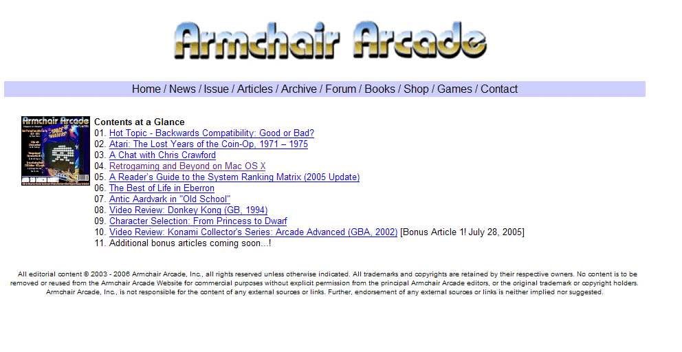
A top banner and  a coloured drop down menu for navigation. Not to many fancy other stuff on the screen.
No side menu. Just clean and simple...
1) The top banner
the selection bar

  Main part: here's where the action is: one could opt for three frames so that no 1 and no 2 are always visible with the content moving in between. Or one page scrolling up and down without frames. Don't think that adding a side menu will help (too damn fancy and popular those side menu's)
2) And below the (c) notification


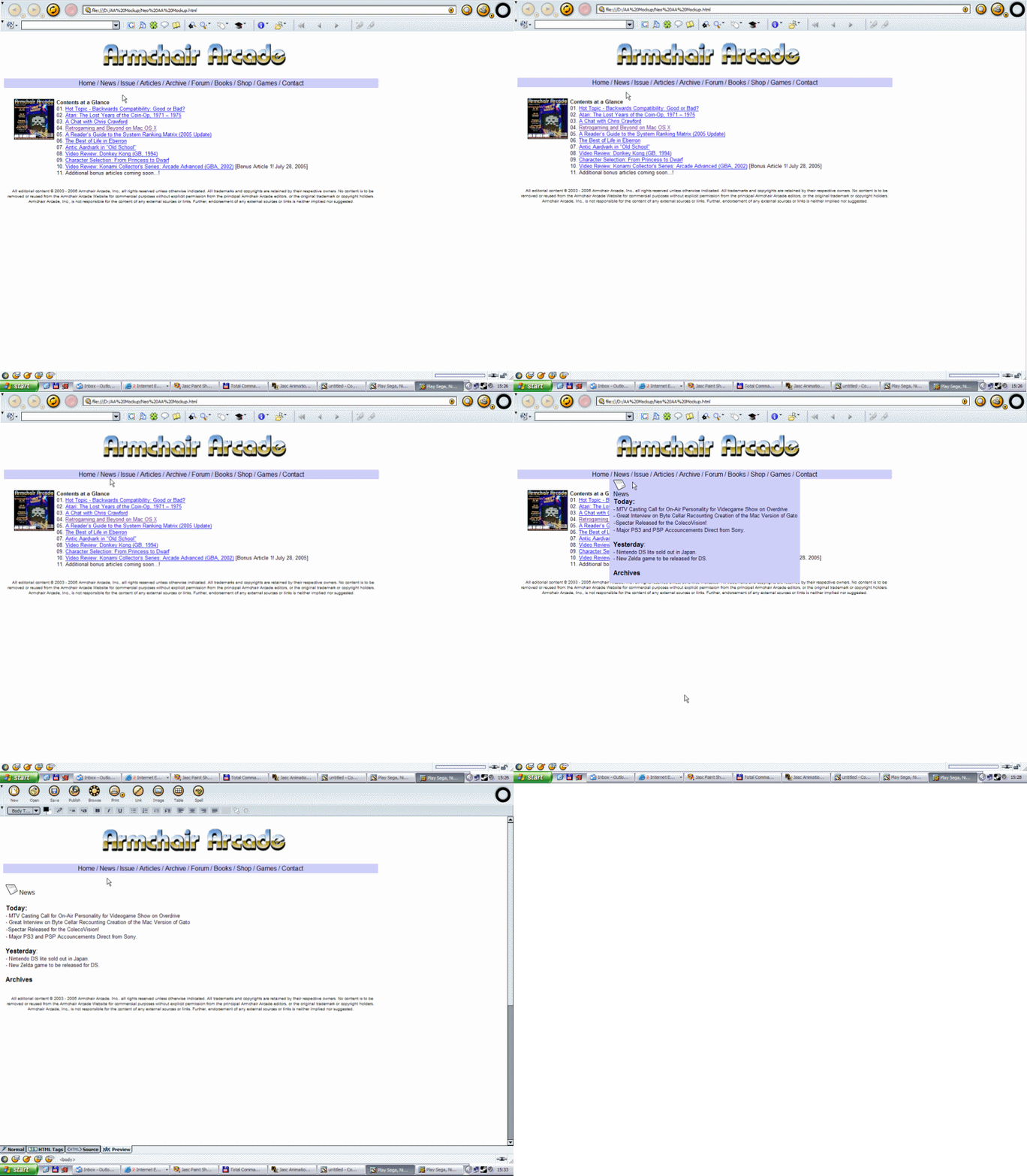
Here's something I would like. A dynamic menu-bar with drop down features. Hover accross one of the words in the bar and a drop down menu appears, click on one of the items on the drop down menu and you'll be taken there. Click on one of the words on the bar and the main window will display contents regarding that word. Below you can see how the news item would sort of work.


Select the news item drop down


Here's when the Issue word has been pressed. Hovering over Issue will create a drop down menu filled with a list of issues that can be selected.
Here issue has been pressed and an issue has been selected for browsing.
Mockup site

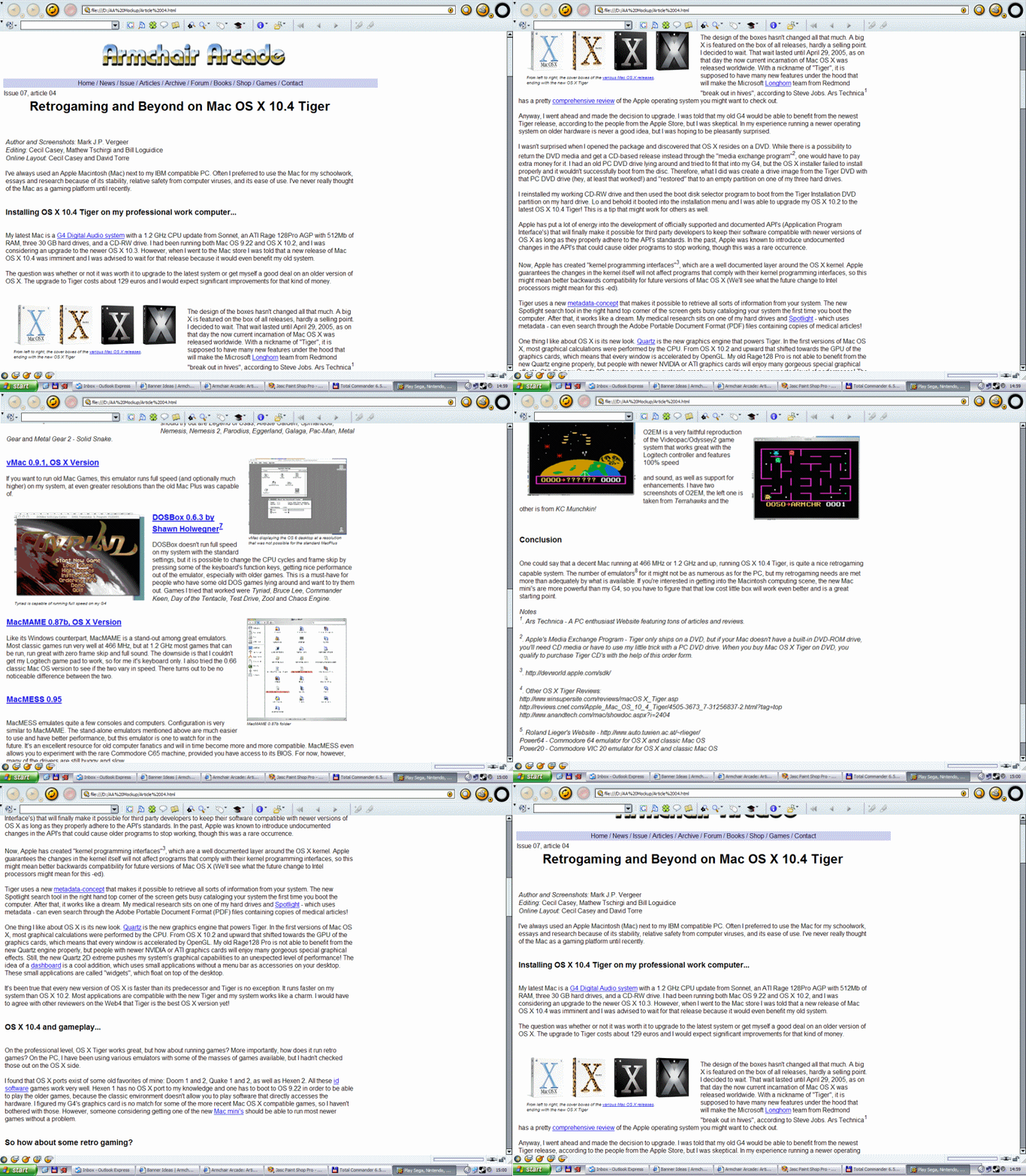
And here an article is selected and browsed through. Note that in this mock up I've opted not to use frames.
article

My 2 cents, what do you think guys?
Totally different than the black pixel Mockup by Matt.But it doesn't hurt to see more options I guess ;)