English:
Peter Struycken on Johannes Vermeer (in English).
Peter Struycken 1980 Interview on the Queen Beatrix Postage Stamp (in English)
Nederlands:
Peter Struycken over Johannes Vermeer (Nederlands)
Peter Struycken Interview uit 1980 over de Beatrixzegel (Nederlands
Peter Struycken kleur-ruimte. Een geluid-kleur project gebaseerd op Skrjabin's muziekcompositie Prometheus, vuurgedicht (1911)
An introduction by Kees Kaldenbach.
Above you will find links to some works of the Dutch designer and visual artist Peter Struycken. In the 1970's and 1980's he did pioneering work combining computers with fine and applied arts in The Netherlands. He is a many faceted designer. If a label were to be put on Struycken 's work, "Minimal Abstract Art with rich contents" or a similar description would probably come close.
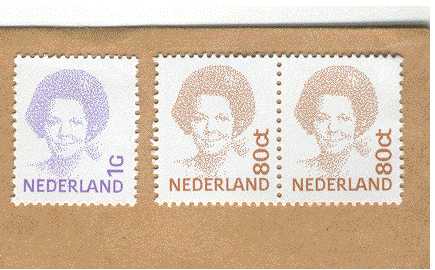
One specific work which has been distributed hundreds of millions times around the globe is basically not an abstract work but is a representation of a face - but within its basic elements it still contains some abstract qualities. Struycken's special qualities combining minimal abstract forms is shown in his small yet impressive postage stamp representing the Dutch Queen, Beatrix. This postage stamp first appeared in 1981 and has been used as the standard postage stamp in the Netherlands ever since.
Normally in creating a stamp (or for that matter any other printed image), a photo or piece of art work is transformed into a half-tone, a screen of dots in a regular grid. Some dots are smaller, some are larger and when the human eye observes the entire printed surface these dots all fuse into a recognizable shape. In 1980-1981 in a breakthrough application of computer technology, Peter Struycken and a number of technicians from the Delft Polytechnic University managed to create a field of equal sized dots placed in a random order in which the relative spacing of these dots themselves consitute the body of the image. Each dot had to be shifted and positioned in relation to the next dot, requiring a massive amount of 1981 computer calculating and crunching power. In the final printed image all of these separate dots are still visible and yet also yield the portrait of the Queen. Thus the screen of dots and the artwork have become one, succeeding in capturing and fascinating the eyes of both laypersons and art lovers in the fields of applied art and stamp collecting / philately. Jump to a detailed discussion. In that page I publish my English translation of parts of a 1984 exhibition catalogue text focusing on Peter Struycken as a many faceted artist. This catalogue "Struycken, Structuur, verscheidenheid en verandering" (Struycken, Structure, Variety, Transformation) was published in 1984 by the Groningen Fine Arts Museum, The Netherlands.
A later work by Struycken can be seen in his pattern of light bulbs on the ceiling of the large Amsterdam Opera/Music Theatre. The grid of lights is subtly powered by a computer programmed by Struycken to create an ever changing pattern of light. It is switched on when the public enters the great hall, turned off during the performance and turned on again during intermissions. The total blanket of light may consist of slowly rolling waves, of moving circles, of bright local flickerings, or of softly changing modulations of intensities of light . By making use of simple white light bulbs minimal means are used to attain maximal results.
Currently Peter Struycken is involved in Video Projects, one of which is the 1998 production of Skrjabin's Prometheus, colourspace. A sound-colour project based on Skrjabin's musical composition Prometheus, poem of fire (1911)
The Ars et Mathesis Foundation promotes the interest in Mathematics as applied to the creation of fine arts. Ars et Mathesis publishes a magazine and organises an annual meeting.
See V2 Institute for Unstable Media. V2 Instituut voor instabiele media.
See some interesting projects at High School of Art & Design, Utrecht (Hoge School van de Kunsten Utrecht).
Heimat presents an interesting combination of Art & Technology.
More info about the author click author.
Text copyright Kees Kaldenbach.
This page was created on 26 June 2000. Last update 21 September 2001.
Search engine words: Philately, postage stamp, Queen Beatrix of the Netherlands, graphic design.